For my project I decided to create a short info graphic piece about shining a positive spotlight on spiders and aiming in it at a young audience. I spent most of Thursday afternoon trying to get a book on spiders, trying all good book shops in Manchester, libraries, charity shops and a book store just outside the Arndale. But with no luck ... :( anyway if any body has any idea please reply... Anyway I decided to maybe create a stop motion animation and found this interesting video in a pop up style.
Just seen this on an animation site and loved it. I've mentioned the Bourne films on here before and that i'm a big fan, well here they've taken the sound from the fillum and re-enacted the action with these toys. It looks like it's for a competition by the toy company, a pretty good idea form their point of view, great advertising when it gets loads of hits on youtube.
Here is a quick peak of some of the imagery I have created for the brief. I am trying something new with this one.
These are the first few, but I have now finished most of it. I have used mixed media on some of the other images, for e.g. the ladder etc. I am pretty pumped about how the others look! Excited to make them move!!!
I was asked to create the home page for a VLE website aka Visual Learning Environment. It was for a PE Department, who wanted something fun, quirky and professional. I hooked them up with this bad boy design which has been inspired by American style sport. Initially they asked for all the teachers faces to be on there, but after designing it, it looked slightly amateurish and didn't look 'right'. So I changed it to the sports team jackets and they loved it! Will let you know when it is up and running online;
I love this album cover. Great colours, and love the use of line to create the movement of the waves and the jaunty angle of the boat and the typography lends this to a young demographic. I also really like the use of texture in the cover, the sky in particular and this sort of style I think lends itself really well to my infographics piece. Shall have a play around!
Was emailed this on facebook and thought it may interest some people in case you are at a lose end this easter!
FESTIVAL OF NEW CINEMA & DIGITAL CULTURE Cumbria & Lancashire 15 March – 10 April
Abandon YOUR Normal Devices this Easter 2010! - It’s time for you to get involved Call for volunteers After the groundbreaking September 2009 launch, the playful, experimental and relentlessly curious Abandon Normal Devices (AND) festival arrives in Cumbria and Lancashire for Easter 2010 with another cutting edge programme of New Cinema and Digital Culture.
For venues such as Grizedale Forest in Cumbria, the Dukes Theatre in Lancaster, the Harris Museum in Preston and Towneley Hall in Burnley the AND Festival team are now recruiting festival, film & new media loving volunteers from all backgrounds that are keen on getting hands on, supporting us during the run-up and delivery of the festival. If you love the buzz of festivals, have some time to spare during 15th March – 10th April, are over 18, friendly and enthusiastic we would love to hear from you!
The roles available for volunteers include: stewarding, ushering, information assistance, festival promotion, supporting the recording and documentation of events, helping with install and de-install of artworks, assisting with set-up and clearing of events, and carrying out market research.
At the following dates and locations: 15–19 March Lancaster 26–28 March Preston 1–3 April Grizedale Forest Park, Cumbria 8–10 April Pennine Lancashire, Accrington, Blackburn & Burnley
Volunteering is an excellent and fun way to meet new people, gain new skills, share your skills and experience, gain insights into the industry and enhance your CV.
We welcome applications from across the region!
If this sounds interesting to you please download an application form from our website www.andfestival.org.uk and send your details to tor.townley@folly.co.uk
Applications will be accepted up until near to the festival, however we encourage you to submit your application as soon as possible. Training and Induction sessions will be arranged.
Please sign up for our newsletter on www.andfestival.org.uk to stay in the loop with latest news on AND. If you’ve got any further questions, please either email tor.townley@folly.co.uk or call 01524 388 550.
I think I may go for Bob.....it has the message for the cause, he has purposefully used really general reference points so the song is both iconic and lasting!
Other ideas include; Isley Brothers - Harvest for the World
I posted this on Facebook and got a huge variety of suggestions including Grandmaster Flash - The Message and Nine Inch Nails - The Hand that Feeds You, but definitely to wordy and not suitable for my stand up and fight in a merry way, folky vibe!
Posted it to the Robin Hood Tax page and they had a vote and are all in favour of the Bob Dylan idea, so I reckon that's my tune!
Hi I am probably way behind the rest of you all with this as I usually just hand draw my storyboards or use post it notes, but here is a link for free to download storyboard templates. What is quite cool is that they do HD templates and have different size areas for writing scene info down etc. http://www.printablepaper.net/preview/storyboard-letter-16to9-2x3
Right so i have been working on my infographics piece and it is very green, natural organic in style, has the spirit of robin hood all over it......flying arrows, trees, acorns into oak references, merriment and needs to be generally jolly, as this is the style of the Robin Hood Tax. But I am completely stumped with the audio. I need a basic background music, to which I can put sound effects. Any ideas merry folks???? I am stuffed if I can find any sort of starting point with this one.
Review on the First Transpennine Express website - for students.
I popped onto this website the other day to look at the promotions and I found the design very appealing.
Immediately when you log onto the page, the colours are bright and fun, for e.g. the purple, pink and greens. This signifies youth and therefore reaches the target audience of students. The style of imagery is very child like and cartoon. I think this is very effective for this website because it portrays the company as being hip, up to date and in touch with the younger target audience. Also, because the images are very playful it makes the whole idea of buying train tickets more exciting. You forget you are handing over money to this company and instead see it as something fun.
There is a range of typography used, but there are two main type faces. One is very formal, and easy to read. This highlights the more important copy and counter balances the fun images. It is telling the audience that they are still a professional company. It also makes it easier to read - if the font was all big and bubbly the page would look too busy and be off putting for the audience. The other main type is a more handwritten style font. This is only used in specific places, for e.g. headings and banners. It gives the page more movement and because of the contrast compared to the formal text, it stands out and looks 'clickable'.
They have used designs which students will be able to empathise with, for e.g. the corkboard with train tickets, pins and paper on. This is another effective method to use because if students can relate to the pictures, they will build a relationship with the company. By building a relationship, the audience will believe the information more and trust what is written. This therefore will give the audience more of a reason to buy the train tickets from this website.
Within the content of the website, the main copy is a competition for students. Companies know that students don't have a huge amount of money and therefore they need to grab their attention if they are selling something to them. In this case they have used a 'Win a chance to pay off your overdraft' to get them to read on. Because this is a website, it is very easy for an audience to click off very quickly. Therefore the first bit of text they read needs to keep them on the page. This website does that very successfully.
Overall, I think this website has been designed perfectly for the audience. I was captivated by it, and found myself stirring at the cartoons and smiling because of how fun they are. I think it is a breath of fresh air compared to other train websites, for e.g. Virgin.
In 2003, following their amazing cult success 'The Matrix', the Wachowski brothers set out to write a sequel and in turn released the simultaneously filmed 'The Matrix Reloaded' and 'The Matrix Revolutions' movies. Aswell as these they also produced a series of animated shorts to expand on the mythologies (,propaganda) and backstories of the matrix world including a CGI feature entitled 'Final Flight of the Osiris' which fills in a small part of the story that is told in the two main sequel movies. At least this is what many fans of the film series believe....
However, in fact this animated short actually plays an integral part of the story.
During the process of the writing their scripts for the films, the Wachowski brothers wanted to create an interactive experience and came up with the idea of producing not only the collection of animated shorts to bring depth to their story but also to make a video game that would see fans immersed into the experience of actually being able to be part of the story.
The result was a collection of three scripts, 'The Matrix Reloaded', 'The Matrix Revolutions' and also the video game 'Enter the Matrix'. The game itself didn't do very well and critics slammed it for minor bugs and dated graphics, and so the game descended into a place where it quickly became forgotten about....
I always thought that this was a shame, and even now almost ten years later I still return to play the game on occasions. The reason being how it connects to the movies. I'm sure that there are many fans of the film series out there who are completely oblivious to the game and are yet to have had the full experience, this is because it was not only the script that was split three ways...it was also the production of the film. As the storylines for the game and the first of the two film sequels run parallel to each other, up to 2 hours of movie footage was filmed especially for video game alone....and this is seen on neither movie or as extras on their respective DVDs. The only way to see it.....is to play the game, or rather 'Enter the Matrix'.
But these individual film scenes only serve as a realistic link to the films to emphasize the scenes in the game, it's actually how the game plays out in relation to the films storyline that makes it so immersive and various pieces of information that are left out of the films (to the imagination of the viewers) are explained in the game for a full picture of what is going down in the plot..... Whilst the films carry the narrative of the main character, Neo, the game takes the route of characters Niobe and Ghost....whom have brief roles in the movies, yet through the game are shown to be vital to the plotline and the overall success of the fight.
Despite the harsh criticism that it recieved I, at a time when I was getting more excitement from video game narratives than that of film, found it to be one of the most engaging games that i'd played and thinking back now i'm still waiting for other filmmakers to take this route of intertwining their plotlines with games in order to create that interactivity with the fans. With the games industry now becoming much bigger than the film industry, this could very well be a trend that filmmakers will decide to follow.
I was watching the Lotto draw last night and noticed something that I found a bit odd. The main logo for it which is seen on the website, betting slips and also the monitors throughout the programme has a font which is straight and moderately formal.....yet the CGIntro for the draw and also the graphic which displays the balls as they come out has a bulky rounded font which looks less formal.
This is the main font....
Yet the other font is nowhere to be seen on the website and I can't find any images of it on any of the major search engines, I did find a video on facetube though which can illustrate my point.....skip past all that crappy singing to about 5:10 and you can see the logo at this point.
I wondered if it might have been a possible delay of a changing over of fonts to this new bubbly version, but then thinking about it I remember having seen this font months ago. So I ruled that out.
My only conclusion is that the BBC have possibly pulled the funding on a re-branding of the game in the middle of its design process (which wouldn't surprise me in the slightest considering the recent turn of events).....otherwise, it just seems...odd. Have a ganders next time its on and see what I mean....
So today is Sunday and I have been up since half 6! Oh the joys of training for a half marathon - well I do actually love it!
I have now just finished my first draft of the storyboard!!! I think I am liking it a lot - I am hoping to really crack it this time and create what Stiobhart called 'A moving KPP sketchbook'.
I think my POA now is to start creating the imagery and scanning it in! See what it looks like! Boo yaaaa!
The talk from Barry was brilliant as he outlined some very basic elements and techniques that are often overlooked, but of which can be key factors to a films success. This is particularly true in regards to his reference toward 'King Kong' (1933) where the title character fights a T-Rex, however, from the few times that I personally have seen this film I always felt more of a connection to the character during the built-up tension that leads to the breaking of the T-Rex's jaw....rather than the comedy aftermath which Barry described.
I was also quite surprised to see the amount of hands that raised when he asked how many of us had actually even heard of Buster Keaton, although this reminded me of a recent discussion that I started a while ago in relation to Laurel and Hardy. I don't recall having seen any Laurel and Hardy been shown on television for almost 10 years, so other than the word of mouth between parents and their children there is really no exposure to the legends of old like Laurel and Hardy, Charlie Chaplin and Buster Keaton for the new generation to be inspired by.
The early slapstick comedians will always remain a source of inspiration for me as I not only grew up watching them, but because Buster Keaton in particular is the idol of one of my idols; Jackie Chan. Throughout his career he has always been very inventive with his surroundings and it's clear to see from some of his films where he takes his inspiration from.....I found this video that someone has put together showing some of the similarities.
In particular, make sure to get a look at Charlie Chaplin's amazing moment getting sucked into a machine at around 1:23.
I couldn't find any videos of it but Jackie also replicated the famous Buster Keaton scene where the front of a house falls on top of him, with only the accurately sized hole of the top window saving him from being flattened.
It was a shame that Barry didn't get to show us some of his own animated works, but when I checked his website later on in the day I was pleasantly surprised to see that he has an interest in the Japanese bunraku theatrical puppetry and that some of his works have been displayed alongside the legendary Kihachiro Kawamoto. Of course I had never heard of this name either.....until the Cornerhouse put on a few of his films a few years back, they were quite inspirational with their use of mixed media, and maybe it's because i'm into kung fu movies....but his film 'To Shoot without Shooting' was brilliant and if anyone is interested in doing the puppet thing one day then i'd seriously consider giving it a watch.
In relation to his but also in relation to Barry's lecture which mainly dealt with giving life to inanimate objects and telling stories from different perspectives, it would have been interesting to see if he has seen Takeshi Kitano's 'Dolls'. I have mentioned this previously in a blog post listing it as my Film of the Decade, and i'm sure that Barry would love it as it is a clear example of what he was trying to get across. It begins as a Japanese Bunraku play with puppets.....but the main bulk of the movie gives life to the puppet play through live action. Watch it!!
Since I first saw one of these star comparison vids i've been completely amazed by just how small we really are. Whilst i've never been a hardcore space fanatic, i've always been interested by it and I remember back in primary school learning about the planets Jupiter and Saturn....and being completely amazed by their size compared to our little rock.
....and I don't care what anybody says anymore, Pluto will always be a planet in my mind.
But it's amazing to think that our gigantic sun is really just a tiny blob. The infographic that I originally saw was really basic graphically but having just looked for some videos to post it seems that more and more people are creating their own versions, these two in particular do a pretty good job of showing just how big things really are....
The progress... Ugh... Think i've been staring at it for too long, i'll look at it tomorrow and hate it all probably. I've been in at Jays all night dog sitting, so I've been doing this and not going out like a normal person....
In my capacity as Student Rep, Dave has asked me pass on a message to you all about his concerns with FRIDAY ATTENDANCE!!!
He has emailed everyone with a timetable of the next few weeks in which we have workshops which are imperative to our next brief Unit 5!
The turn out for the sessions so far (there have been 2) has been quite poor and people who are not attending are going to struggle when it comes to the next project. It is also unfair on Dave and the students who have been attending for him to have to go through these sessions again.......so come on guys.......pull ya socks up!!!!!
Below is a copy of the timetable:
12/3 Digital Video Workflows 19/3 DVD Authoring Workshop I - basic showreel 26/3 Film Language - cinematography, sound & editing
EASTER
16/4 DEADLINE for Unit 4 23/4 Brief for Unit 5 30/4 Camcorder Workshop 7/5 Final Cut Pro - basics 14/5 DVD Authoring Workshop II - advanced interactivity 21/5 Studio production 28/5 Studio production & Unit 5 Deadline
If for some reason you haven't received the email with this timetable on, then please email Dave with the correct email he can use to relay important information!!!! David.Griffiths@themanchestercollege.ac.uk
if either of you are reading the blog today can you tell me where my pile of stop motion drawings of the owl flight for the "YOU" brief are?!?!? They were in a box but that is now empty and i have looked everywhere but alas to no joy! Really need them as got a few drawings I need to add to make the piece work.......cheers guys. I am gonna be here all day now til 5pm or I will be in on Monday.
So have just been commissoned by my local pub to create a poster for a band night. It has to be black and white and I have a few logos that need to be included but other than that I can do what I like. It is a poorly paid job, but paid all the same.....my first £20 for my work (well not 100% true but keeps the poor student designer image up)!!!! :) I'll keep you posted with my progress but it'll be all about thirds, contrast and lines I think although may throw in a character or 2!
Have just watched this with Louis and I completely forgot how amazing this is. With reference to some of the points made by Barry Purves it shows the art of the gag set up really well, but what I love most is that like watching a good silent movie you hardly notice it has no speaking in it. This is due to amazing music, the tempo tells the story so well and for example there is a very definite sound when Shaun has an idea etc. Also the use of expression or the thought process can be seen really well, so it goes to show there are times when less is more and the need for a language based narrative is totally unnecessary.
Just going through some of my bits and bobs and found this in my photos. It is my mood board for the "You" Brief. I started out as a mood board and it slowly became more of a picture or piece of art but I wanted to call it a mood board as I felt it really captured what the whole feel of my piece was to be like.Anyway feel free to comment or critique constructively! Although probably won't change it :)
So yesterday we had the honour of hearing a talk by a world class and highly experienced animator Barry Purves.
He started off the lecture basically saying "to be an animator you will need PASSION and a PASSPORT" and from his wide experience animation is basically dying in Manchester and the UK. He talked about the closing down of 2 big animation studios in Manchester alone this year (Cosgrove Hall and Hot Animations) and how even Channel 4 has stopped commissioning short films. So OK that was a bit of a downer type of start to the talk and I did for a second feel my heart sink a little, but then he continued to talk and by the end of the lecture I was feeling just as excited and passionate about what I do and maybe a little bit more determined than when I walked in.
Barry Purves has been in the business since 1978 and he started his training in Cosgrove Hall and worked on the likes of Chorlton and the Wheelies, Wind in the Willows and for me most impressively DANGERMOUSE.......one of the cartoons of my youth :) His career has taken him all over the world and he has won numerous awards for his short films. He is an author and also a director and one can tell from his lovely "lovie darling" way of speaking and his big booming voice that he started his career on stage.
I loved his answer to Kitty's question when she asked "What software do you mainly use" and his answer to this was to show us his hands! Yes he is very old school and uses mainly puppets and stop motion these days. It was nice to have someone who has seen so many changes in the industry talk and relay his wealth of knowledge, especially as I am really interested in exploring more old school ways of working.
He showed us first a great little animation called "John and Karen" which is about a couple who have had an argument and the man (in case a polar bear) is trying to make amends with his girl (the penguin) and how this unfolds....clip below.
He talked about simpleness and how this piece could have worked with 2 actors and still have been good but because with animation you are in control of everything and can bring a new dimension and metaphor to the scene it can be made really really rich! I liked the way he talked about using every element in your design as I like to do this (or so I hope I do) and he said that everything we place there has to be there for a reason......(reminds me of Alex and her make each mark purposeful)! He also talked about silence and stillness and how when he started he just wanted to make everything move because he could, but it is the still moments that can speak volumes.
Another thing he talked about was showing the human thought process. We watched Mary Poppins and her talking umbrella and he explained why this umbrella was so important to the viewer as it was expressing Mary's unexpressed thoughts and emotions. It is the understanding of the human thought process that keeps the viewer locked to a piece of work. For example the bit in King Kong when after he kills the T-Rex and he moves the jaw back and forward just to check if he is still alive. These little moments of insight that make something special.
Here is another piece of animation he showed us:
He said this piece showed the art of a good gag! Where timing is important but most of all having that moment when it is left to the viewers imagination. The lift scene in particular was a good example of this. He talked about being non-literal in our work and finding a good distance with this. Being purposefully weird is what I think he meant here. He said we need to be credible in our metaphors to show something that is credible and honest and how we can use an artificial situation to give a message.
Oscar Wilde "Give a man a mask and he will tell you the truth"
If we show a different view or perspective in our work we can really make a message hit home in a more direct and honest way than if we tell it straight. This is funny to hear regarding animation as I once had a very talented homoeopath say the same....there is power in metaphor indeed.
To end the talk he said,
We need to be passionate and know that whilst it isn't easy it is the most rewarding job in the world. Our passion will evoke a reaction as it taps deeply into the human psyche when they see something brought to life. We can liberate ourselves with animation and should use all the elements around us to bring a story to life. We need to be story tellers and performers to get the most out our characters and you have to LOVE IT.
Really enjoyed this talk as when he had finished I completely caught his passion for his work...he was very contagious, but that is maybe just me and my susceptibilities!!! But he did mention he would be really happy to come and do a workshop, day, couple of days even a week if we could arrange it with the tutors....so what do you say Alex, Stu, Dave...please please please!!!!!
Sorry Alex for not being in today, but I am on such a roll with this brief that the only sensible option was to continue here at home....cos I has my tings all set up nice!!!!!
My only proof of this Stu and Karl will be my amazing storyboard on Monday when I come in on my day off to get started on the computer (well that's my plan). So eat them words boys!!!!!!!
Alex will you be in on Monday to go through my storyboard?
Hi Alex. Sorry I've not been in this morning, I'm having to wait for a guy to come and fix the shower. I need to be here when he comes so i can hide the cats from him; we're not supposed to have any pets!
I will be in this afternoon, once he's been.
As proof, if proof were needed, that it's the definitely the shower, and not the Guinness I drunk last night, here's a picture of me with the broken shower.
Irrefutable!
As further evidence I will attempt to take a picture of him fixing the shower, and stick that on here too.
Today I came across this little old gem...my autograph book and boy did it make me chuckle.
I am a very organised person as a lot of you know and have lists for lists. Whilst skipping through this book, what did I find?? A check list!! This book was from 1997 - so I was 8, and even then I was making lists. I love this!
for some reason the memory of these just popped into my wee heid this morning and i realised they could be classed as infographics:
the animated 'guide sequences' from the hitchhiker's guide to the galaxy, created by rod lord. [i refer, of course, to the original 1980's BBC version, not the sacriligeous yankee remake].
i could only find a couple on youpube, but the whole set are available on the beeb's H2G2 page - although you'll need real player to play them.
i used to love that series and those animations, when i was a kid & i was always mystified by what all the text you couldnae read [coz it scrolled past too quickly] was saying. that was back in the days before computators and intarwebs - when all we could do was try and pause the animations on clunky old VHS video recorders to see [mostly unsuccessfully] if we could decipher anything from the wobbly static filled still-frames.
Here is a mothers day card I made for my boyfriends mum (lazy git forgot to buy her one!!!). So again I played with the idea of thirds and did 2/3rds sky and 1/3 typography! Also used colour and line.
At the beginning of the brief Stíobhart showed us Eduarda Lima's infographics about Global Warming. At that moment I didn't really realize how good they were and how much they could inspire me.
After watching this series of animation several times I do know now that I want to get inspired by her work. I love mixed media work - if you all remember my first brief was all about mixing different materials.
Also, as my target audience are children I think it's a good visual style for them to enjoy!
I leave you her animations, in case you haven't seen them.
As you probably already know GorilLaz have a new record out. I've been checkin out some of the tracks before i get it and it's lookin like another hit! They've always been big collaborators but with this one they've gone mad working with some great artists like De La Soul, Lou Reed, Mark E Smith, Snoop Dogg, Mos Def amongst others!
I'm a big fan. I love the music, Jamie Hewlett's artwork, the whole concept!!
Here's some of the artwork for new album Plastic beach -
And here's the video for one of the new single STYLO -
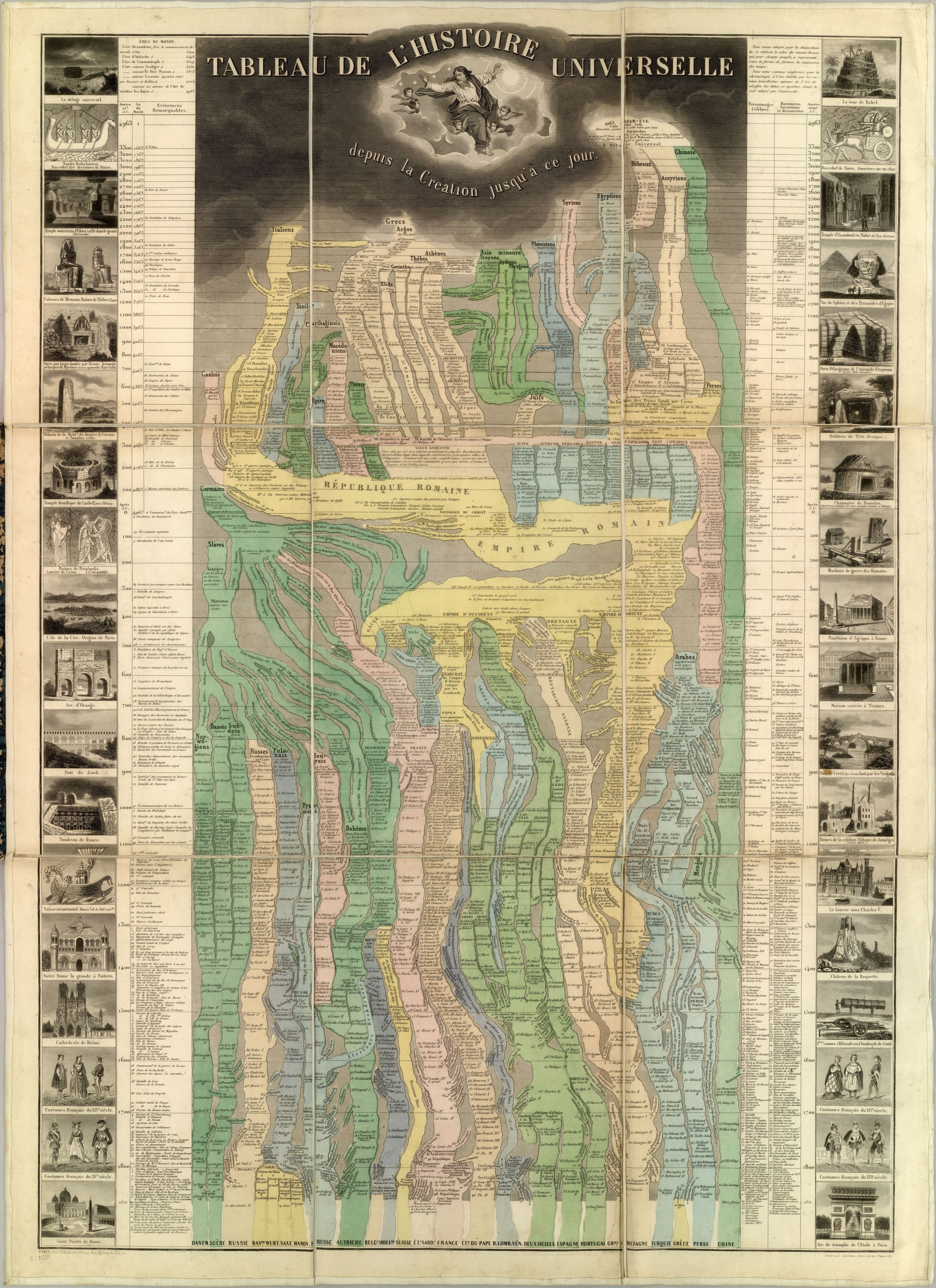
Been revisiting some of these old infographics a little this morning, I absolutely love them because for years i've been planning on doing a similar thing in relation to greek mythology (and potential fact) by taking a map of east end of the Mediterranean and charting the locations and voyages of various legends such as the Argonauts, Odysseus, Hercules, etc. .....i'll get around to doing that one day.
I also like these examples because whenever I watch documentries about historical events, i'm always asking my folks what was happening at the same time elsewhere in the world (ie. what point was Japan at during Tutankhamen's reign, etc.) ....i've rarely come across anything that documents events in relation to each other, apart from maybe the events relating to Cleopatra and Julius Ceasar/Anthony.
Over Christmas I watched the FOUR HOUR LONG film 'The Ten Commandments' starring (surprise surprise) Charlton Heston and I found it odd that Moses lived at the same time as the Egyptian pharoah Rameses considering that he appears early on in the old testament of the Bible (which i've been reading in intervals ever since). It made me wonder a lot, because we know for a fact that Rameses existed....so where's the proof of Moses?
I can't actually find Moses or Rameses on this map after searching all over for them, if you spot them then please tell me. But anyway....here it is....an infographic on the complete history of the universe.
This is another similar one which is pretty interesting, it compares the length and height of all the major rivers and mountains in the world.
- I'd just like to point out that despite my enthusiastic interest in it, I am not a Christian. I enjoy reading the bible for comedic value only.
This is a message for Stu - I don't have your email because I canny remember how you spell your second name!
It's 7.43 and I was about to leave my house 15minutes ago and I couldn't find my railcard!! Disaster! Without a railcard it costs an arm and a leg to get into Manchester from Wallasey. So, I think it would make more sense for me to go over to Liverpool and do my work. They have little spaces in the Tate Musuem where you can work so I am gonna do that. I hope that's ok - it just seems pointless to spend all of that money to get there.
As you can see I am up and have my bag completely ready...
If you have never seen this cartoon then you really should take a look at it! It is called "The Marvelous Misadventures of Flapjack" and is by Thurop Van Orman, who is also the voice of Flapjack. This cartoon is very strange and oddly funny, with a lot of adult references throughout. It is about a young boy, who was raised from birth by a whale called Bubbie who also seconds as a boat for the pirate Cap'n K'nuckles. They live in a harbour town called Stormalong Harbour and most of their mis-adventures occur whilst looking for the fabled island of candy, called non-other than Candied Island.
There are many things about this cartoon that I really enjoy. I love Flapjack, as he is so cute and naive with his sickly sweet voice and sometimes disturbing voice massive eyes and blonde hair, whilst everythung else around him is weird, creepy and old, which creates a great contrast! The style of the cartoon is very cut-out monty pythonesque in style. I would say that the creator has been influenced greatly by Terry Gilliam in his style and humour.
Each episode has the feel of an old sea shanty, with tales over eleborated and over embellished. The use in candy in the story is genius. From a child's perspective, the mission for candy is easily understood, but as an adult the use of the candy is likened to a drug. It is maple syrup and sugared goodies sold in the local tavern and at times they will beg, borrow, steal and maime for the stuff! It is all done to the backdrop of an old tattered victorian sea town! Many weird and nasty things happen and apart from the town being a large part of the background, the mouth of the whale also plays a big part in the stories. But the more I try and explain this cartoon the weirder it sounds, your best bet is to take a look for yourself, so I have posted an episode for you all below....enjoy xx
Hello guys, I wanted to share with you the stunning artwork of a photographer and surfer called Clark Little. He photographs the waves of Haiti from the inside, he has even created his own camera!
His work is absolutely brilliant.
He sells his photographs on his website (check it out!)
I would love to have one of this amazing pictures in my living room!!!
I started setting up a new basic website for my stuff a few weeks ago, but since then i've kind've hit a brick wall with it. I started it on a spur just so that I had something online that I could direct people to so it hasn't gone through a full design process (apart from a few designs of the front page).
Obviously i'm aware that none of my contact info is on there yet but can I get some thoughts about the looks, layout or content of it. My reason for choosing a black background is because I HATE-WITH-A-PASSION these new computer screens which have over-the-top glare and whenever I go onto a brightly lit website (which pretty much means most sites) I end up turning the brightness setting right down. Some people may like this, I dunno, I just like to read something without having to squint and hope that I wont go blind.
This was my previous website which is a few years old now, which I still like the design of and the bright colours. I would actually prefer a bright website, but i'm not sure....glare is a real off-puter for me.
Here's another couple of things you may/ or may not wish to check out:
Fancy participating in a major new art installation by a renowned contemporary artist? Right here in Manchester/ Salford?
Of course you do! The only catch is that you have to get your kit off.
It's by Spencer Tunick, is called Everyday People and is gonna be at the Lowry.
The website says: "You don't need to be beautiful. You don't need to be unusual." So it should suit you lot fine! HO HO HO
Here's the link - http://www.thelowry.com/events/everyday-people/home/
GET INVOLVED!!! I might.
The other thing i would like to bring your attention to is the re-opening of the Peoples History Museum, aka the Pump House, as it's housed in an Edwardian pump house.
It's just undergone a 2 YEAR!!! and 12.5 MILLION squids re-development, and so I expect it to be pretty nifty. I've seen some decent exhibs there in the past, one in particular I remember was a history of protest and revolution, including banners, war and propaganda posters and graphic design and was very good.
AND, unless my memory's playing tricks on me, it's got a great pub next to it called The Mark Addy that does good quality food, real ales, and is right on the riverside with a outside seating area that's beautiful on a sunny day.
Here's the website, it was not working properly a minute ago but i'm sure they'll have fixed it soon -
I do a ton of stuff in Photoshop/Illustrator, I get IFX magazine and it inspired me to try a different style... Still allot of work to do, It's very time consuming!
Yesterday I was told by Creative Boom that my design had been chosen for their banner, for the new website launch! I was overly excited but wanted to wait till it was on the website to share with you. My bio and blogspot will be under the 'banners' section tomorrow. It will be on the website for a fortnight.
I have had even more of a fiddle with it. Thanks for your comments Sarah J, what do you think of these two? I think because of the simplicity of my name font - the scribble adds a bit of fun! It also makes it look more of a pencil. But, would appreciate your opinion on which one is better;
Thought I'd just mention a couple of fillums that are out in the flicks this weekend that I reckon are gonna be well worth the inflated price of cinema tickets and popcorn and crap sweets.
The first is adapted from the best selling novel by Swedish writer Steig Larsson The Girl With The Dragon Tattoo. I read the book a few months ago and after a slightly slow start was gripped by half way through. It's a story about the nature of corruption and abuse, and it's hero, Lisbeth Salander, is surely the most original character for years. I be can't be bothered wrting a review of it so i'll just copy and paste what some other folks have said about it -
Stieg Larsson is the best Swedish crime writer of the decade - Kristianstadbladeta violently entertaining trilogy...may it never end - Arbetarbladet A huge, 500-plus-page opus, a multilayered, multi-character tale by a writer of some considerable power. Full of social conscience and compassion, with great insight into the nature of moral corruption, The Girl With the Dragon Tattoo just knocked me out. During the time I had my nose stuck in its pages, I was thoroughly consumed by the work, and in those periods when I had to put the book down, I found myself grumpy and anxious to return to Larsson's narrative A... when I finally put the book down, I was still unable to sleep, my head filled with the high-definition world that this author has crafted A... already I'm thinking this could be remembered as the best crime novel of 2008 A... This book shows how exhilarating crime fiction can be.Ali Karim, The Rap Sheet website.http://therapsheet.blogspot.com/2007/12/case-of-grand-larsson.html""A...a publishing sensation, an accomplished crime writer who seemingly came from nowhere A...a memorable debut and deserves most of the hype with which it is being published in this country A... Crime fiction has seldom needed to salute and mourn such a stellar talent as Larsson's in the same breath - Sunday TimesThe ballyhoo is fully justified...At over 500 pages this hardly sagged...The novel scores on every front - character, story, atmosphere - The TimesWhat a cracking novel! I haven't read such a stunning thriller debut for years. The way Larsson interweaves his two stories had me in thrall from beginning to end. Brilliantly written and totally gripping - Minette WaltersAs vivid as bloodstains on snow - and a perfect one-volume introduction to the unique strengths of Scandinavian crime fiction - Lee Child
I've read a couple of reviews of the film and that's supposed to very good too. It's a twisting weaving plot and it doesn't pull any punches with graphic scenes of violence/ torture/ rape. It's Swedish with English subtitles but don't let that put you off you lazy monkies.
Here's the official UK trailer -
The next one is called Green Zone and is from the british director of the modern classic Bourne Trilogy Paul Greengrass. Greengrass teams up again with Matt Damon for whom Jason Bourne was a career defining role. If you haven't seen the Bourne films you definitely should, they are slick, fast paced, intelligent and stylish and make the James Bond flicks look hopelessly quaint. If he applies the same raw, visceral film-making style that made the Bourne films stand a class apart from the usual Hollywood action flick to the war in Iraq, the setting for this film, then this is sure to be a great piece of cinema.
I read about this the other day and thought i'd wack it on here as we've been doing poster design lately. It's an Exhibition of film posters on at a graphic design gallery in London called Kemistry by Warsaw-based-studio Homework.
This is what the Guardian had to say - "Building on the long tradition of Polish-language versions of Hollywood posters, they're deadpan masterpieces."
They do have a distinctive style. Very bold use of colour and shape. Simple but effective.
There's more on the site - www.kemistrygallery.co.uk