
I arrived on the Tuesday and got straight to setting up. When you attend places like these, you completely take for granted the amount of effort that has gone into creating the look. We had to do everything from, dressing the mannequins to putting the adidas stickers on all of the boards etc. It took a good 48 hours to finish but it looked super when it was all done. We had a massive space, and the designers had to make sure it all matched and that it created an iconic look and feel to adidas. The ways in which it did this was;
- the colours. There was a common feel of blues, greens and blacks. This gave the exbo a very futuristic look. Which I think was to make adidas look modern and up to date with all the latest technology (which we are!!)
- the typography. adidas uses the same typography over everything which again emphasizes the iconic look for the brand. The font is very simple, bold and easily legible. It also has connotations of fun and youth. Again, these are all words that adidas would also use to describe their brand.
- the shapes. There were so many shapes and movement in the set up which made it look extremely exciting and interesting for people who walked past, for e.g. the footwear circle, the micoach stand etc. It wasn’t just a basic set up with footwear and apparrel laid out. If anything, it looked more like an obstacle course which obviously fits in with the sporting genre.
- Extra props. They were little extras that added to the overall look of the place, for e.g. colourful bean bags, bright wardrobe boxes. These may seem small but they definitely made the whole room seem much brighter and fun.

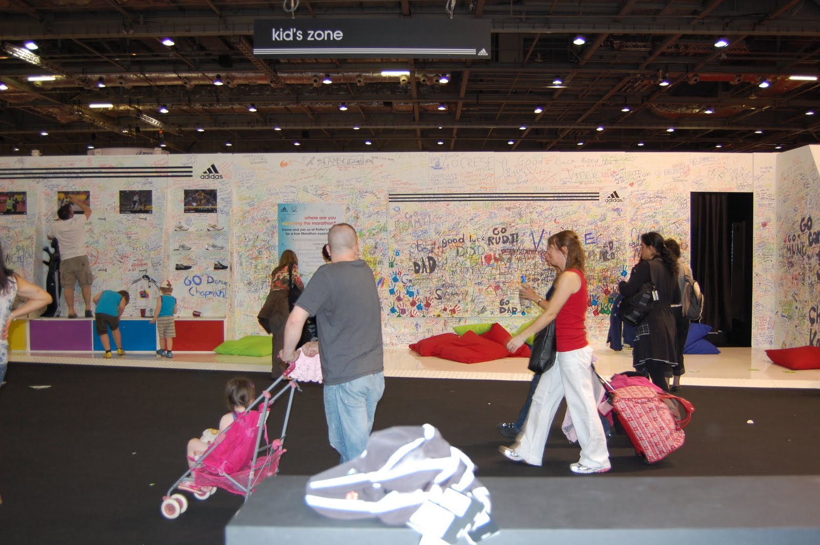
We also had a blank wall which was for kids to write on, and on the other side of the room was a bigger wall for adults to write their ‘impossible is nothing’ quotes. This was hugely popular. To the point were people were lining up to write on it, and the doodles went all the way around the room instead of just on one board. This shows how popular interaction is. People love to get involved and place their mark.
Micoach is adidas’ new personal coach system which plays live audio feedback into your ear when you run. This particular product had its own stand and feel to it. There were big tv screens projecting a film throughout the day. Using mixed media like this made the audience more involved and again made adidas seem much more hip and up to date.

I felt very proud to be part of such a great design set up. There were a few points I wanted to put down of things that I appreciated. The little things that people forget but as designers we need to remember;
the stickers for all the logos
the colour of the floor and the material, for e.g. carpet? Wood? etc
the interaction for people
the banners
everything overhead
the colours
the shapes of the furniture
seating
lighting
signage, for e.g. ‘pay here’. Different ways to present this.
I really enjoyed my week, and I loved our set up. Visual Merchandiser? Mmm...too many possibilities of careers.
No comments:
Post a Comment